I had a conversation with a friend recently about Infinity tables, and how important layout is when playing that game. As far as tabletop minis games go, Infinity isn’t unique in having a lot of the game hinge on terrain, but it’s a lot more honest about it. The game is obviously unplayable with poor or no terrain, and both players will realize this quickly.
Compare this to a game like 40k or Warmachine. In 40k, Dark Eldar want terrain to hide behind if they aren’t going first. If they are, they run a serious risk of getting shot off the table before getting to do anything. In Warmachine, several factions have a lot of Pathfinder units that benefit from rough terrain or forests or both– a board with none of these suddenly becomes an uphill battle for them, and factions without Pathfinder struggle on boards with a lot of terrain. It’s an unequal distribution which causes issues at the game level and skews the “competitive” selection of units for both games.
Spending a lot of the weekend playing Warframe made me think about Infinity terrain as well. Levels in Warframe are randomized, but they’re highly interactive. Maps are made up of cells (or tiles) which are hand-designed, attached to each other through connectors (hallways) and the occasional smaller room, all put together to form a map for a level. It’s a surprisingly elegant system, and despite how important level design is in the game, it’s still able to put together random maps in a fairly compelling way.
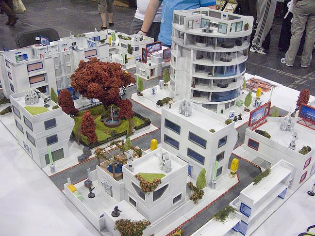
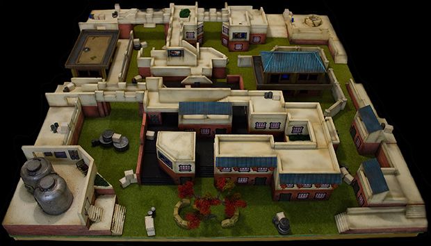
It makes me think of Infinity tables. There are major set pieces (cells) with scatter terrain (connectors) and smaller buildings (rooms), all forming the game board. Mostly, these pieces are hand-placed by one or more players before the game starts, and they then circle the table, eyeballing sight lines and other details, before deciding that the table is fit to play on and starting a game. Because of this, Infinity draws a lot of attention from passersby, because the tables it’s played on are generally very intricate.
Infinity tables that are fun to play on follow a general set of rules:
- No unavoidable corridors running the length of the table.
- No sniper towers that can cover the entire board.
- Plentiful cover and places to hide behind, out of sight.
- Good opportunities to use every type of weapon– from short range to long range.
- No obvious choke points.
- (Advanced) One side should be slightly more advantageous to start on than the other.
- (Advanced) Objective locations for the missions to be played on the table should be relatively even.
- (Advanced) Multiple tiers of elevation, and ways to reach them.
- (Advanced) Multiple exits from points on the board, to prevent getting locked down.
- (Advanced) Models of all sizes need to be able to maneuver.
It’s a lot of rules, but a lot of players who are used to the game just sort of internalize them. Very rarely does anyone go down a checklist of the above, but you’ll occasionally see someone look at a table and say “hmm, this is too open” or “this is too crowded”. Playing the game enough, and getting experienced enough, allows you to see the problems with a table once you’re practiced at it. it’s not easy to do– I played a game recently with another very experienced player where we both thought the board looked reasonable until we started playing on it.
The same attention and care goes into level design elsewhere. When League of Legends was first released, people criticized it for “only having one map”, and games are often judged for not having an adequate number of maps to play on. I remember Counter-Strike and Unreal Tournament, and the large number of maps those games had, of which maybe two or three ever got seriously played. The single map of League (and the smaller numbers of maps in other games) tend to have a lot more going on, and are carefully and thoughtfully created.
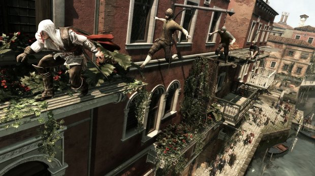
Game spaces are really important. They need to be functional, navigable, and visually appealing, and varied enough to stay fresh and not get boring. I remember complaints about the original Halo, and its endless samey levels towards the end of the game, and the major complaint of the first Assassin’s Creed that it got too repetitive. It’s telling that some of the biggest changes in those two games were in their level design, with AC going to an entirely new location with new architecture and Halo varying its levels much more in its sequels.
Probably a lot of my care for good level design comes from a childhood playing Thief. That game’s area layouts were the lynchpin of the experience, and made the game in a lot of ways. I pay attention when levels are interesting and matter, as opposed to being irrelevant, or an afterthought.


