I made an attempt yesterday to define “good design”. By extension, I tend to think that things that don’t fit the definition fall somewhere on the spectrum, where some omissions might make “great design” merely “okay design” or “passable design” and flagrant violations would start to fall into the realm of “bad design”.
Some things are badly designed. This can be a result of omission or ignorance or error on the part of the designer, or it can be intentional. What I want to look at a bit more today is why some things are designed badly. Something can be designed badly and still be “good” on the whole, and it’s important to remember that good design isn’t the end-all-be-all, nor is something good necessarily well-designed. Design isn’t the only consideration in the creation of something, but I think it’s important to be able to tell the difference between a good thing with good design and a good thing with bad design.
So, definition of good design again:
Good design is when the thing in question accomplishes what is desired in an efficient, reliable, intuitive, thorough, positive, and inspiring way without contradicting its own goals, being dishonest or misleading, or being unnecessarily obtrusive or overwrought.
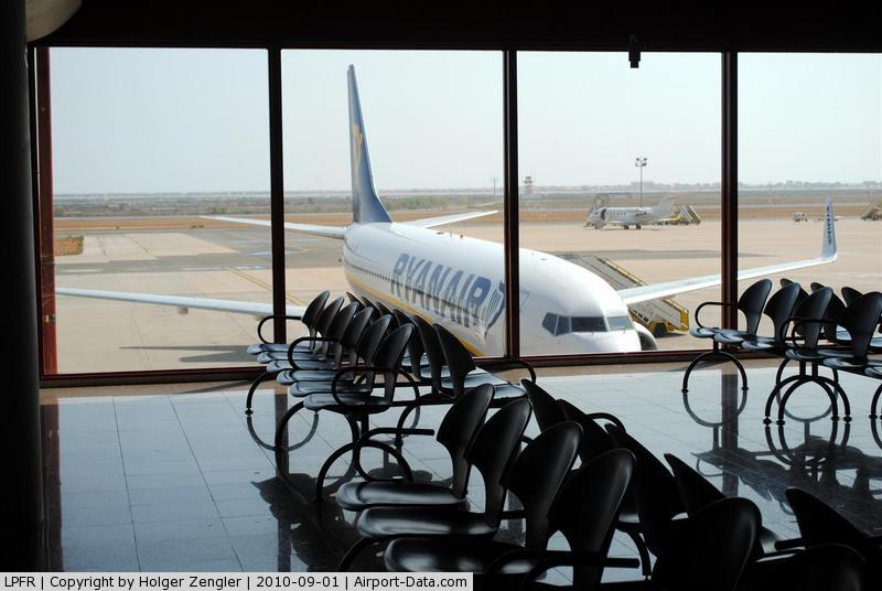
Let’s take an easy example: air travel. Getting on planes is inefficient and a generally frustrating experience. It contradicts its own goals of getting people from place to place effectively, it’s often misleading, and it’s certainly obtrusive.
Why?
The easy answer, and the one you hear a lot from frustrated passengers at airports, is “because the people running things are idiots”. This is rarely actually the case. A process that huge and with that many people involved that runs for decades does not continue that way because the people in charge aren’t good at their jobs. Air travel is specifically designed to be unpleasant in a variety of annoying but not enraging ways. It is intentionally designed badly.
Again, why?
I’ve talked elsewhere about follow-the-money problems, and air travel is a pretty clear one. Most of the additional purchases you can make beyond simply buying your ticket involve removing the various annoyances that you have to put up with. The markup on these is huge, and involves relatively low overhead for the airline. Loading the plane is inefficient and obtrusive, and so you can pay money to get on sooner, ensuring that you don’t have to deal with the annoyances of waiting in line or worrying over whether you’ll have a place to put your bag. Seats get increasingly uncomfortable to encourage you to upgrade your seat to something a bit more comfortable. Sitting closer to the front of the plane means you get off sooner, and are more likely to get your connecting flight. All of this is *designed*.
There are other considerations as well. You can board earlier if you check in ahead of time on most airlines. This is another designed thing– the airlines don’t want no-shows, so they incentivize you to check in early, so they have an accurate headcount and no empty seats on the flight. If you help them get an accurate headcount sooner, they will remove a layer or two of annoyances from your trip.
So, that’s how we get bad design in things we don’t like. What about bad design in things we do like?
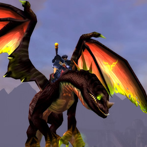
Since I was already talking about flying, it’s time for me to get controversial. World of Warcraft has flying mounts. They effectively function like cheat codes– you press a button and you can fly like a GM does. Because the flight mechanics are very simple and offer no opportunity for gameplay (there’s no combat in the sky), flight simply allows you to go up in the air and bypass whatever you care to, skipping mobs and obstacles to get to a particular goal. It’s probably the single most damaging thing to WoW’s gameplay that they’ve ever done, and it’s extremely telling that they “take it away” for every new expansion. It shouldn’t surprise anyone that this happens– with flight enabled all the time, there’s very little game to play, just fly down, click, fly up.
“But players love it!” you say. “I love it! Don’t tell me flight in WoW is bad design when I’m having so much fun with it!”
Here’s where it gets interesting. WoW’s flight model is bad design– it contradicts the goal of players playing the game instead of bypassing it, it creates a situation in which you’re (unintuitively) better off not playing the game than playing it, it misleads players into thinking the ground game is boring (it is, in fact, the only game), and it forces the rest of the game to be significantly overwrought just to accommodate flight. As above, it’s a cheat code, there’s little to no skill involved in flying, there’s no associated gameplay, it’s effectively an invincibility code and terrain hack all in one, with a pretty wrapper and nice effects.
It is, however, fun. Cheating is fun. Create an item that can be used to instantly kill any target and everyone would flock to it. In Destiny, the “loot caves” were immensely popular. Cheating is even more fun if it’s apparently sanctioned by the game. How can flight be cheating if it’s something the designers put in there? Well, everyone makes mistakes. Consider the outcry when Destiny shut down its loot caves, how angry players were. Imagine that multiplied ten thousandfold, if Blizzard were to come out and say “hey folks, you know what, flight was a mistake and we’re removing it to make the game better”. Pandora’s box is open, there’s no going back, even if in every interview where it comes up Blizzard devs all but say outright that flight was a terrible mistake that they wish they’d never put in the game.
I mentioned that good design inspires later design. It’s very, very telling that nearly no major MMO has implemented WoW-style flying mounts, with the exception of FFXIV (which operates on a slightly different content model anyway). Other games have included flight, but it’s been more limited, and generally included more gameplay. WoW’s flight didn’t inspire; it was a cautionary tale.
But, it’s fun, so it stays. For some people, WoW is a better game for including this feature; good design or no. It trades good design and the game’s mechanical integrity for player satisfaction.
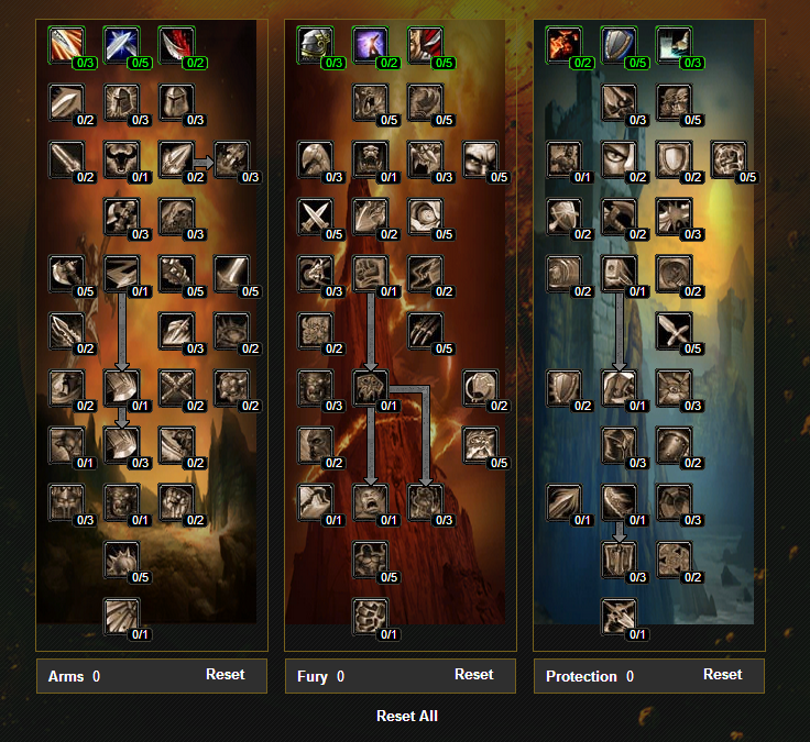
Another, more common example of bad design in WoW, and one that they changed: the old talent trees. These were badly designed because they were unintuitive, not very thorough (depending on the class), EXTREMELY misleading and dishonest, and very much overwrought. Talent trees presented a set of options that the game portrayed as equally good, when the reality was that there was a “right answer” and a whole lot of pitfalls along the way. For a long time, players and designers alike considered this “good design”, as being able to separate the wheat from the chaff was considered a skill.
The problem was, the optimal builds were posted online and if you weren’t following one of those, you were probably playing badly, or at the very least noticeably sub-optimally. The choices were illusions, there was a right answer and then a lot of mistakes, not a genuine series of choices. If the talent trees had been permanent and unalterable (as similar things were in earlier games), the problem would have been exposed FAR sooner. MMOs preceding WoW often had extensive “build planners”, so you could figure out what permanent choice you made as you levelled up and didn’t ruin your character by making an incorrect choice. Also bad design, and while WoW’s talents improved upon it, it still only went from “appalling” to “not great”.
But, all of that being said, up until the point Blizzard specifically came forward and said their talent system was bad design and they were removing and replacing it entirely, players would argue that it was a demonstration of skill, a sign of knowledge and expertise, and a way of separating the “good players” from those players who foolishly thought that because a game presented them with apparently equivalent choices that they could feel comfortable picking any of them.
I’m picking on WoW here, but a lot of games fail at this. They present a bunch of choices with similar costs or requirements, but the efficacy of those choices is wildly uneven. Sometimes games will be honest with you and say that this choice will make the game harder; more often they do not.
These last two were good (or well-loved) things designed badly by mistake. What about something designed badly on purpose that we like?
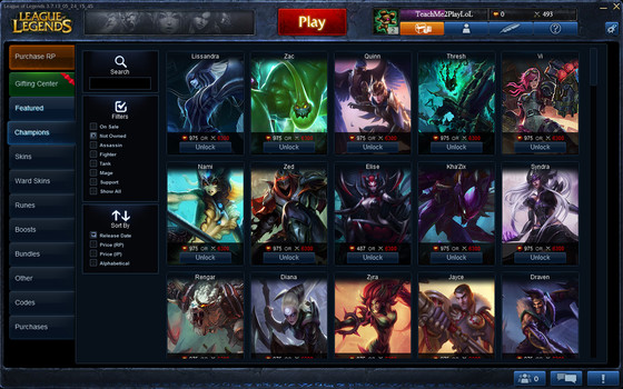
It’s hard to find good examples of this, because things that we like tend to cloud our vision as far as good design goes. Microtransaction games are extremely popular, and often sacrifice good gameplay design in order to squeeze more money out of players. The ones that do this more acceptably are largely just better at hiding it, though they’re still making the same design sacrifices.
I want to look a bit more into why we might design something badly on purpose in the next part of this.


1 comment