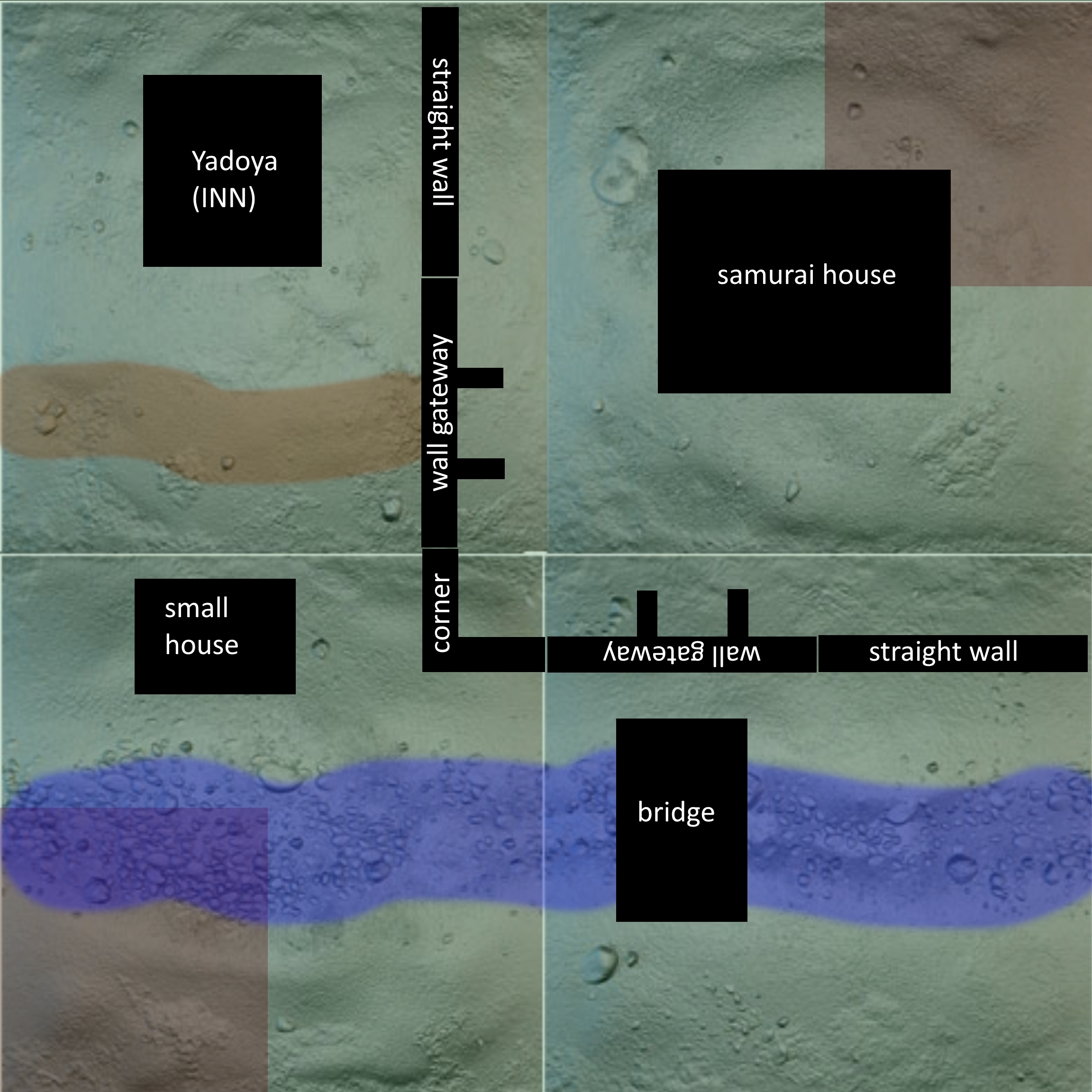
Yesterday I talked about how I was working on a miniatures game table, but trying to apply video game style level design tenets to it. I want to delve a bit more into that today. Here’s the board again, what I’m going to call “version 1.0”:
I’ll see if I can lay out how I got to this design. The first part is the tiles– they mostly dictate the landscape, because they come from a particular retailer and I can’t change the ones I get. So, we’re looking at two mostly flat grassy tiles and two tiles with a stream running through them.
Bushido is a primarily melee-oriented game, but there are ranged attacks. On an open, flat table, battles tend to occur exclusively around objectives or, depending on the scenario, in the middle of the board. You get a pretty standard scrum right on the center line, because that’s how action flows. Ranged attacks are inordinately powerful in this kind of scenario, because there’s nowhere to hide and no cover.
The first piece, for me, is the wall. It cuts the board, broadly, into thirds and makes it slightly asymmetric. The player starting behind the walls is in a more defensible position, but the player starting outside of the walls has more maneuvering room and better board control. The front corner of the wall extends past the center point of the board because if it didn’t, we’d just get a center-board scrum again. The natural flow of the board means that fighting will happen right around the gates– both players have to travel a roughly equivalent distance to reach them, and they’re natural choke points. I like this both because it splits that center scrum into two (flanking is a real thing in Bushido, so you don’t want to commit your whole force to one gate only to get flanked through the other) and also because it thematically makes sense that a battle over a walled building would focus on the entry points.
It’s important to remember that Bushido has two types of deployment: corners, marked on the map, but also along opposite edges. Any board I create has to support both types of deployment at a minimum, and ideally can support any opposite-corner or opposite-side deployment.
There’s an alternate wall layout, using the same pieces:
We’ll call this 1.1, or “long wall” versus “square wall”. The long wall can only be oriented as seen above or in a mirrored orientation; the buildings and bridge are also movable and I’ve just placed them in more or less sensible places. We can tweak these as we go to improve the board.
It does a couple of things better than the first revision, and a few things less well. Deployment is a lot more even; being behind the walls isn’t as much of an advantage anymore. There’s also no real choice for the player behind the walls to deploy partly outside of the walls if not deploying in the corners. The board is a lot more open, and the walled area is still defensible but largely less relevant.
There are a bunch of things I don’t like about this layout. The first is that the only relevant gate is the one right near the corner deployment area. The gate in the corner is doing no one any favors, and might as well just be dead space. Unless there are scenarios with objectives in areas opposite the deployment areas (spoiler: there aren’t) that space is basically going to be dead space.
Second, deploying in that corner with the second gate SUCKS. You’re really badly boxed in while your opponent basically has the run of the board, and you don’t even have the advantage of being in a defensible starting position.
On the other hand, this could work better for certain scenarios. There are a couple of layouts, but before we can refine them, we’ll need to see what kinds of scenarios we might play. That’ll be next.


