Lately I’m working on a table for a new miniatures game I’m trying, called Bushido. It’s an interesting accompaniment to Infinity– whereas Infinity is futuristic black ops and a huge emphasis on ranged combat, Bushido is more mythic Japan and has a very strong emphasis on melee combat. Notably, it’s also played on a board a quarter of the size of an Infinity table, making things much more close-quarters.
More on Bushido later (probably). What I’m really thinking about is level design. I come from a video game design background, a world of de_dust, Blood Gulch, Facing Worlds, Summoner’s Rift, Lost Temple, Warsong Gulch, and a variety of other famous maps. These maps are carefully designed, usually iterated on thousands of times, and are meant to stand up to repeated play. Summoner’s Rift is largely the same map as it was when League of Legends first launched– certain things have been tweaked over the years but the overall layout is almost entirely unchanged. You can play in that space five, ten, a hundred times and have different experiences. Team composition, strategy, adaptation, all of these change the experience on the map.
So, a Bushido board. Bushido is a miniatures game, and even the most terrain-heavy miniatures games tend to be built to be modular, and change every single game. I’ve been playing miniatures games for over a decade now and I can say with a reasonable amount of confidence that I’ve never played on the same table twice. This is considered normal. From the perspective of the video game level designer, this is kind of madness. Modularity is considered the most important thing for a set of minis game terrain– people tend to talk about “sets of terrain”, not actual boards themselves, because you just take all the pieces and assemble them on the fly into a board that you then play on once or twice and disassemble.
I’ve unconsciously slipped into the same thought processes when I’ve helped out with minis terrain or built my own. You can see the usual sort of result in the above picture– it’s a textured map with distinct “objects” placed on it. Individual elements are internally themed and look good on their own, but the whole table is kind of just a space where terrain elements are placed, rather than something designed. It’s a system that’s very vulnerable to bad design– tables that are unbalanced and don’t really get improved because they don’t get any iteration. Instead you get a kind of tribal knowledge of “what makes a good table” that isn’t really universally agreed upon. Some games lean into this, suggesting that tables are laid out by the players beforehand, alternately placing terrain elements until there are “enough” on the table.
As I build my own Bushido table, I’m dissatisfied with both the non-specificity of table design in minis games but also the overall look. Minis tables are rarely beautiful, even if they contain beautiful pieces. The house in the center of the above picture looks fantastic, but it’s just plopped into the middle of the table. Now, look at Hanamura, from Overwatch:
Just viewing it from above looks pretty nice, no? It looks like a believable space, but it’s still nuanced and playable. When you’re on the ground, you can see stuff like this:
It’s a GORGEOUS shot, and that’s entirely playable space. Everything there is serving a purpose and contributing to that portion of the level while also being aesthetically satisfying. It’s what you lose out on when you do procedural spaces. Diablo recognizes this, peppering its procedurally generated levels with “set pieces”, key areas that are laid out a specific way to accomplish a goal, but it’s still possible to see the seams; it lacks the aesthetic appeal of something totally crafted.
It makes me wonder: why can’t the same thing be done with a minis game? Shouldn’t it be possible to develop a board that’s less like randomly generated dungeons and more like Hanamura? (Note: I’m not saying that Hanamura is necessarily a pinnacle of perfect level design, but it is a fun map and it looks fantastic, and I’m not bored of playing on it repeatedly.)
Here’s what I’m starting with:
Excuse the vertical cell phone shot, it’s bad and I feel bad. I’m considering how to design this space to be a map that’s fun to play on multiple times, and that while I may very slightly tweak it, will look mostly the same for months or years. This mostly-static design lets me make all of the terrain elements look intentional, not plopped down, really make the whole think look like an intentional space.
I need a more complete understanding of the game to accomplish this, but I don’t think it’s impossible. The fidelity of a minis game is lower than a video game, which makes the overall project easier. What I need is a good understanding of the various scenarios and how they interact with the game board. With luck, a single board will accommodate all of them, but we’ll see. I may be able to iterate on this in this space.
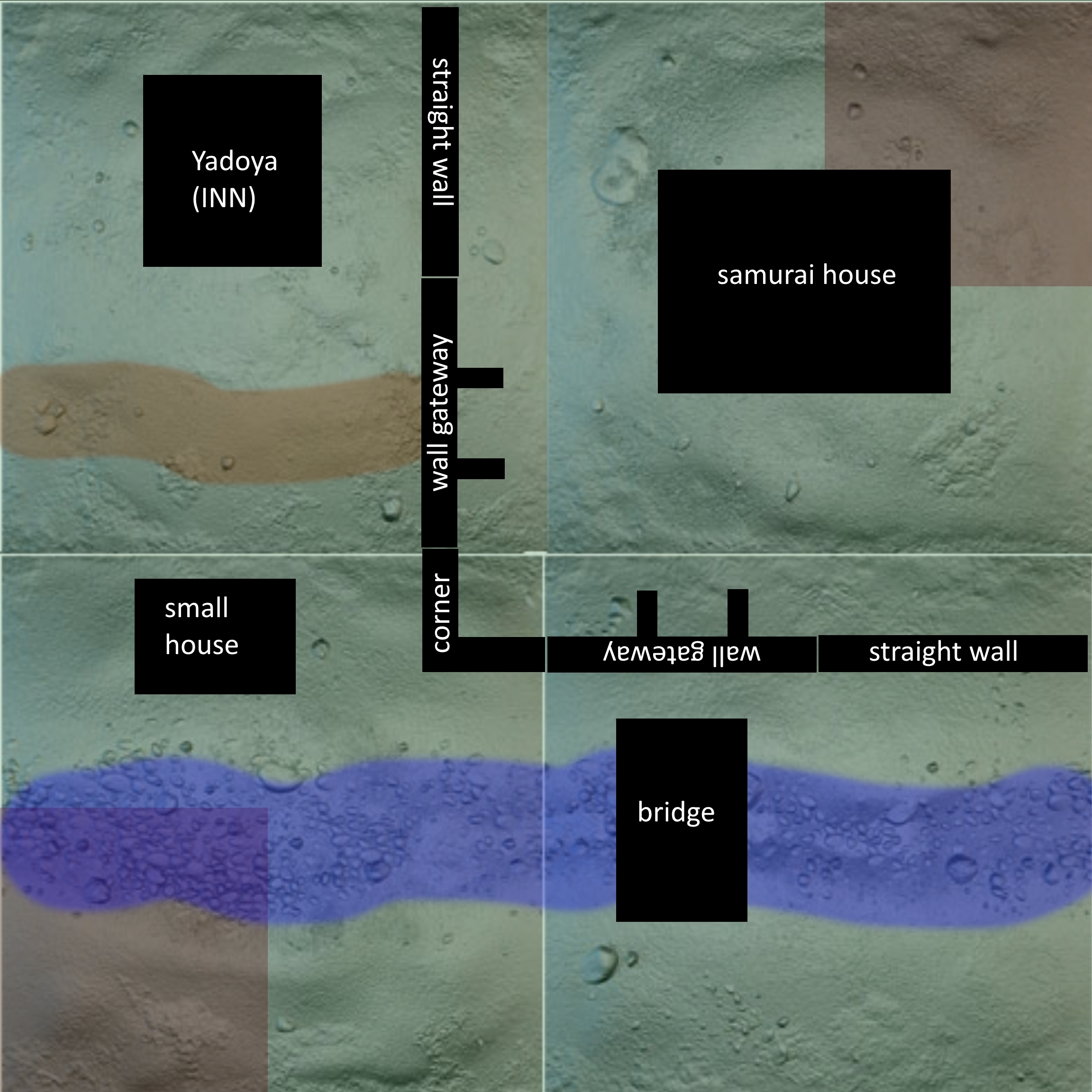
Here’s the layout I’m currently envisioning, with black boxes for structures (darker portions are the size of corner deployment zones):
It’s a start. We’ll see where I end up.


